celonis X paFnow
PAFnow (part of Celonis) is a Process Mining software completely integrated in Microsoft Power BI and Microsoft Office 365 for the analysis, visualization and optimization of almost any process. 97 percent of Fortune 500 companies already use Microsoft Power BI.The integration of (Pafnow) process mining software with Microsoft Power BI empower users to gain full transparency about processes. Businesses with large quantities of data or for small optimization projects can do much more than just analyze the data. They can collaborate, communicate and directly start optimization measures to find optimization potential leading to cost savings and profits for businesses. For any Office 365 User to utilise and break down the barriers to Process Mining.PAFnow Companion is installed to enable data transformation and display of the visuals in the PAFnow Reports. The Companion must, therefore, run in the background to transform an event log, and should run to display the report or use the PAFnow Visuals.
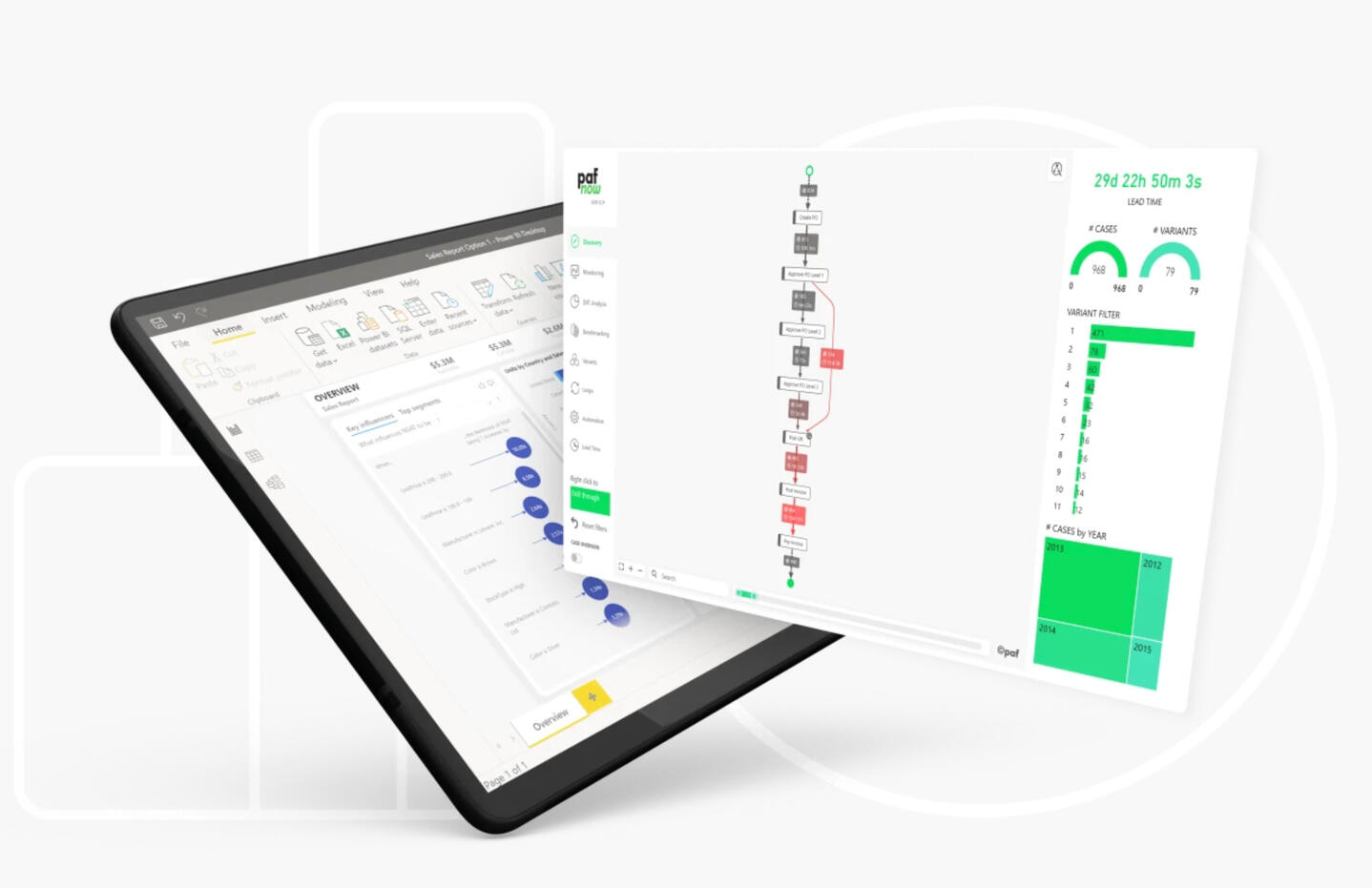
Image from Pafnow
01
MY ROLE
I was the only UX/UI designer during the time working alongside with the graphic designer, developers and a product manager. Later on, I worked with designers from Celonis producing all major deliveries and presenting these to the team.
02
THE CHALLENGE
The challenge was to come up with a newly intuitive experience that can help users to manage all their reports, customise custom visuals for versioning and work more efficiently than before.
03
VISION
I was part of this ambitious project to redesign the entire report management application. Together with the PM and developer we identified current UX gaps:• No user experience• Noise• Application positioning and scalability• Lack accessibility (user control and error prevention)
04
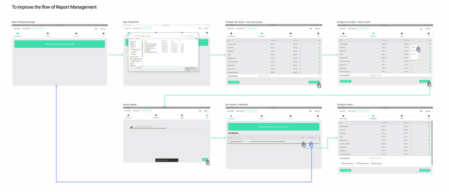
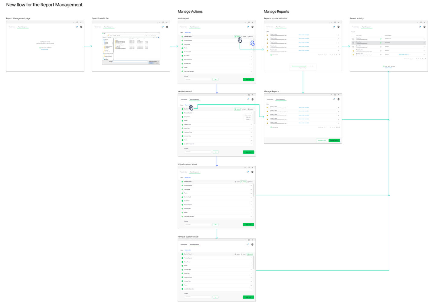
USER FLOW
To gain a holistic view, we took a top-down approach to understand the users flow. I created the mockup on miro for to gather feedback and then came up with final decision about the exact pieces and parts that will be included.
05
KEEP IT SIMPLE,
BUT SIGNIFICANT
Using crazy 8, I sketched out a few ideas and chose to develop a high-fidelity design to gain feedback and approval from users and the team early on.In the next days, I tried several approaches and iterated continuously while learning from feedback and industry experts.
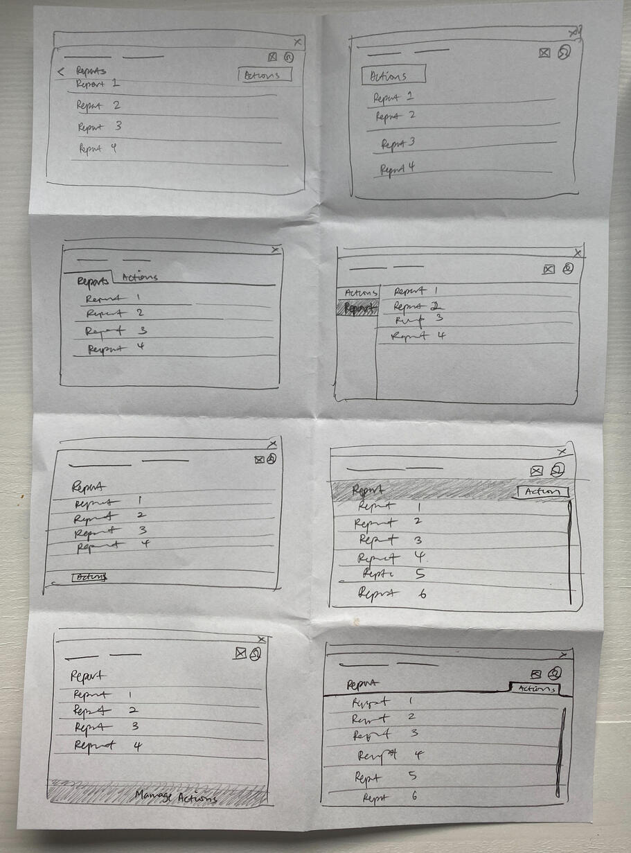
The crazy 8 designs were shared with my colleagues and four potential designs were selected.
The designs were then turned into high-fidelity for further discussion.
06
FEEDBACK
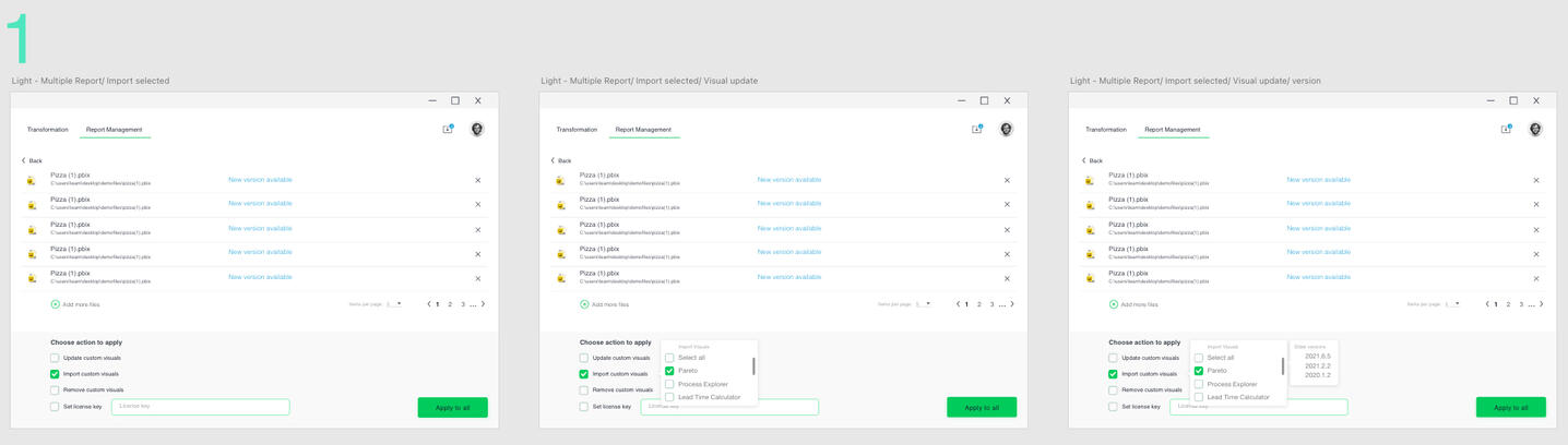
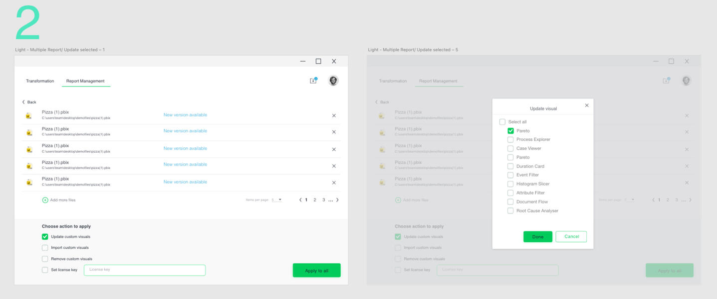
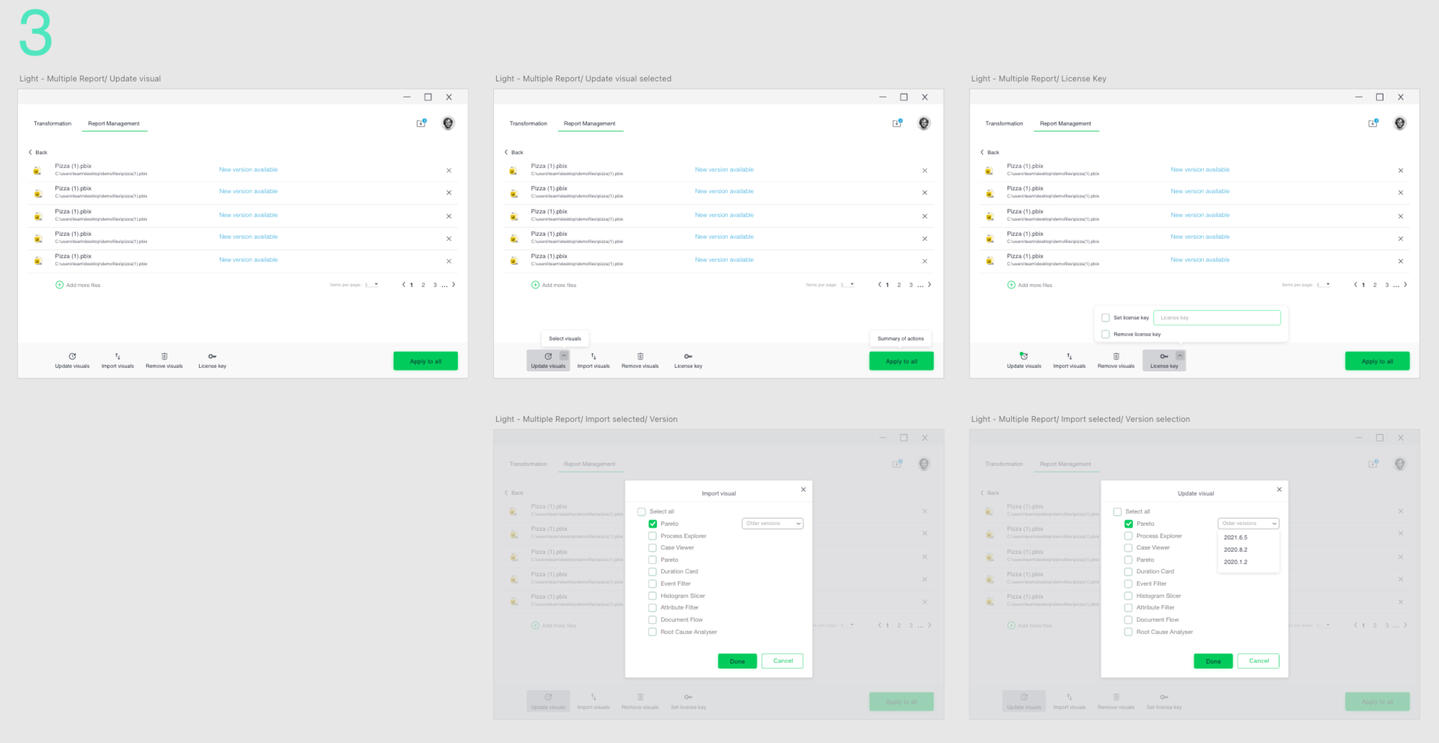
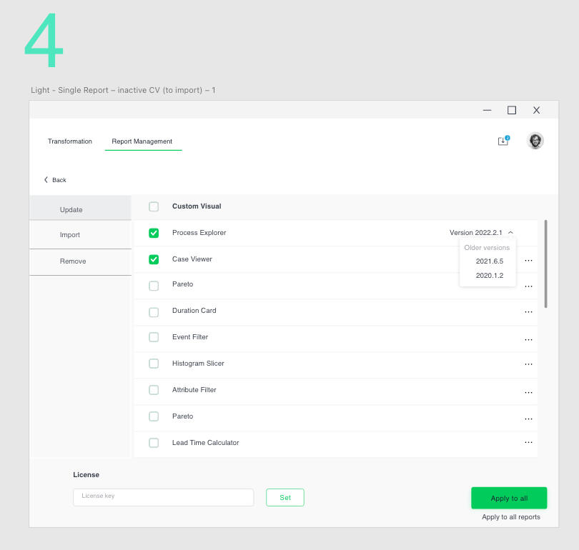
I wanted to keep the design consistent to the Single report following Jakob’s Law of Internet User Experience which illustrates that designing familiar experiences are preferred. The reason for this is that people are accustomed to how certain things work, it requires little to no thinking or a learning curve. However, when this law is violated, you can often find users confused as it immediately creates an unfamiliar experience, which in turn will most likely involve people feeling frustrated, and likely leaving the platform.The challenge is to enable users the freedom to change different versions of the custom visuals in the report, to import new version and/or remove custom visuals not in used. After understanding the user goals and behaviours, I have listed some key concepts to create high-fidelity wireframes.
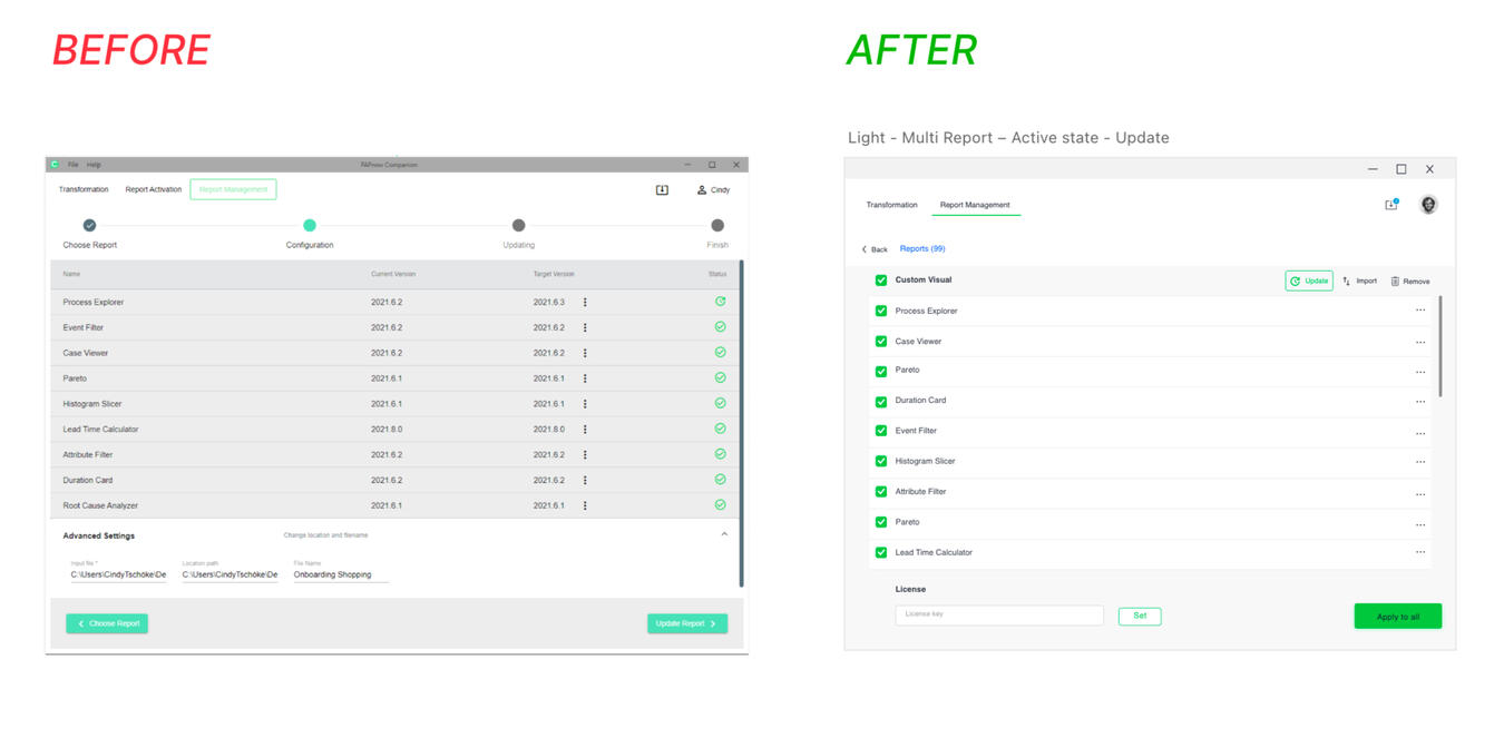
• Set all custom visual selected on default as users usually perform actions on all custom visuals. This speeds up the process.• Provide each custom visual with version control• Include icon to the actionable buttons (update, import, remove) for accessibility• Add progress bar and different error prompt in the event an action may impact or interfere with the existing report
The design was further iterated to keep the same styling as the one for single report. It is scalable and has better accessibility of the CTA buttons.

07
FINAL DESIGN
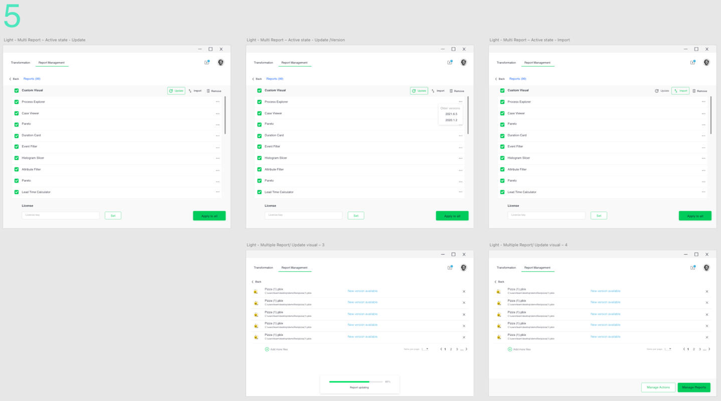
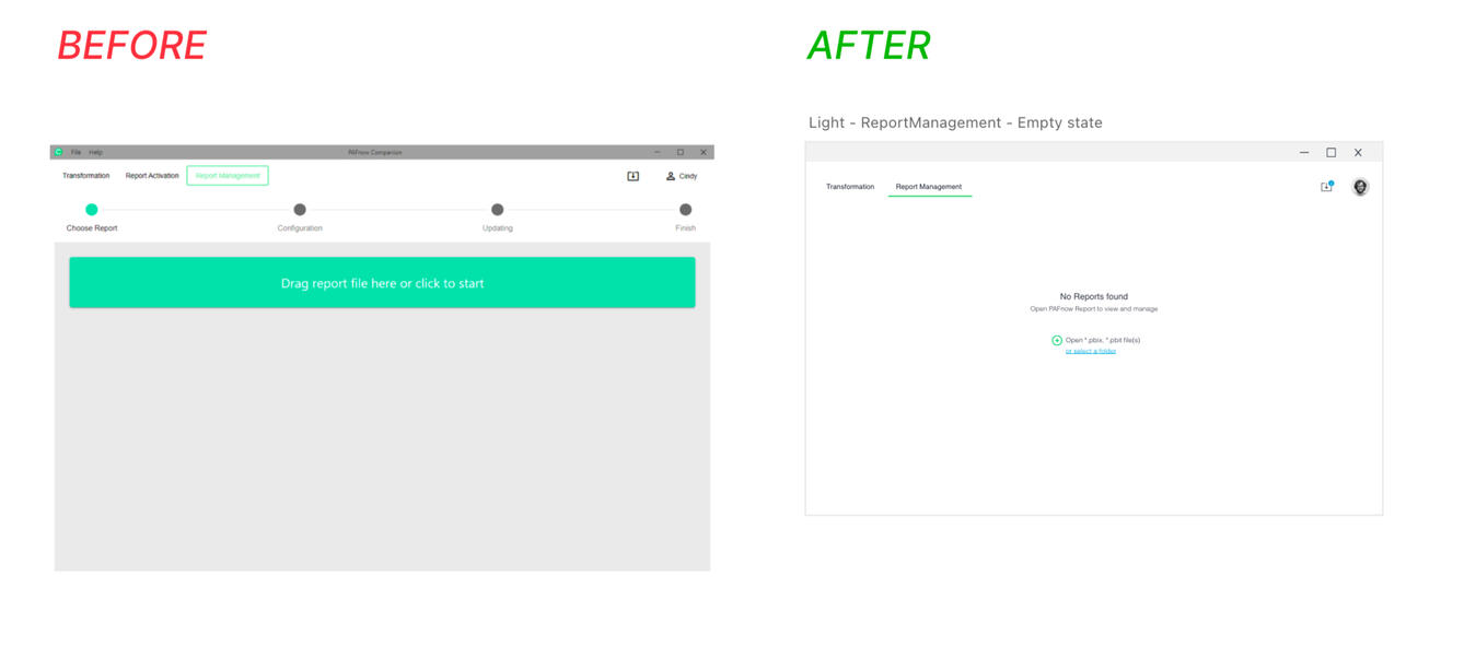
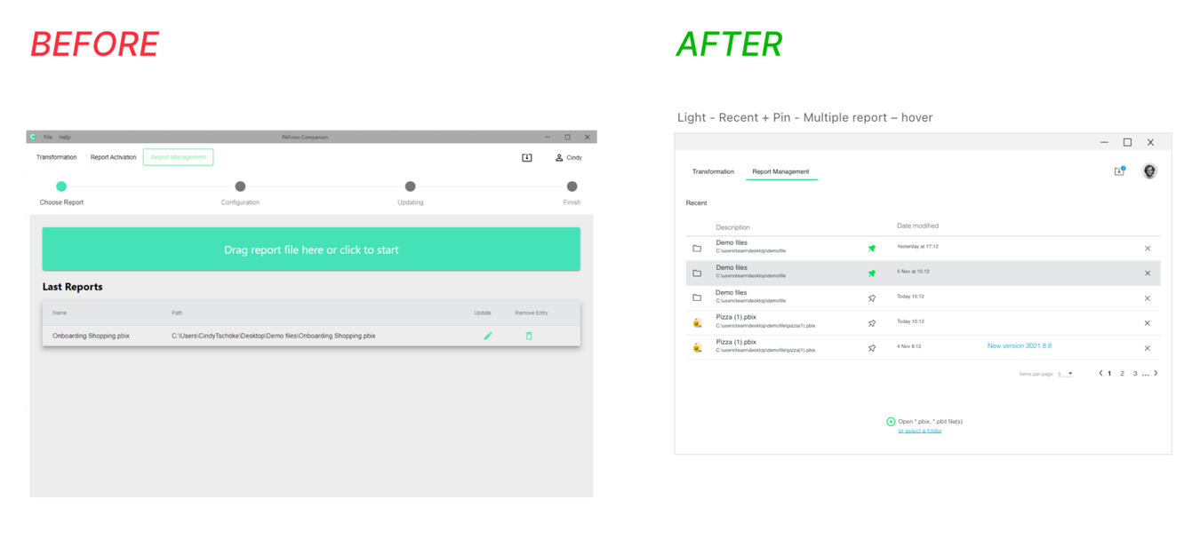
We are happy with the results in general but there were still some assumptions to validate.• The assumption that user need the progress bar to navigate the report management. It was not needed and was removed.• Advanced setting details was moved to the RECENT (activity) page. We realised that it would be better to give user an overview of the report name and its path location along with the date the report was modified.• User can remove custom visuals easily and have them import back instantly. The removed custom visual will be grey out and placed on the last row of the custom visual.• Should a SET button be removed as the APPLY ALL button is the main Call-to-action.
Purposeful notifications let user know that something important is going on so they can decide on the next action.
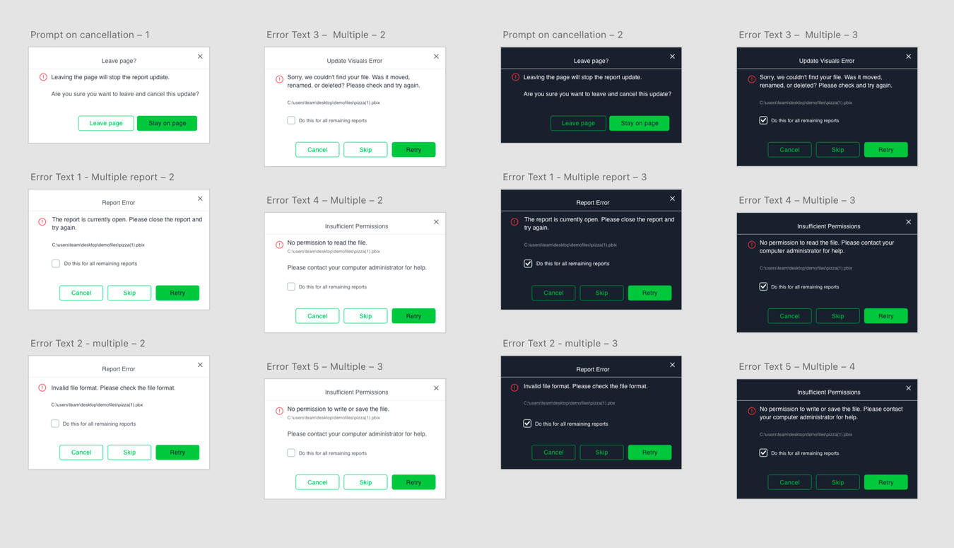
The prompt message appears when user attempt to take an action that may interfere with current activity (in light and dark mode).
Cindy Lin-Tschoeke | UX Designer | [email protected] | Last updated in 2023